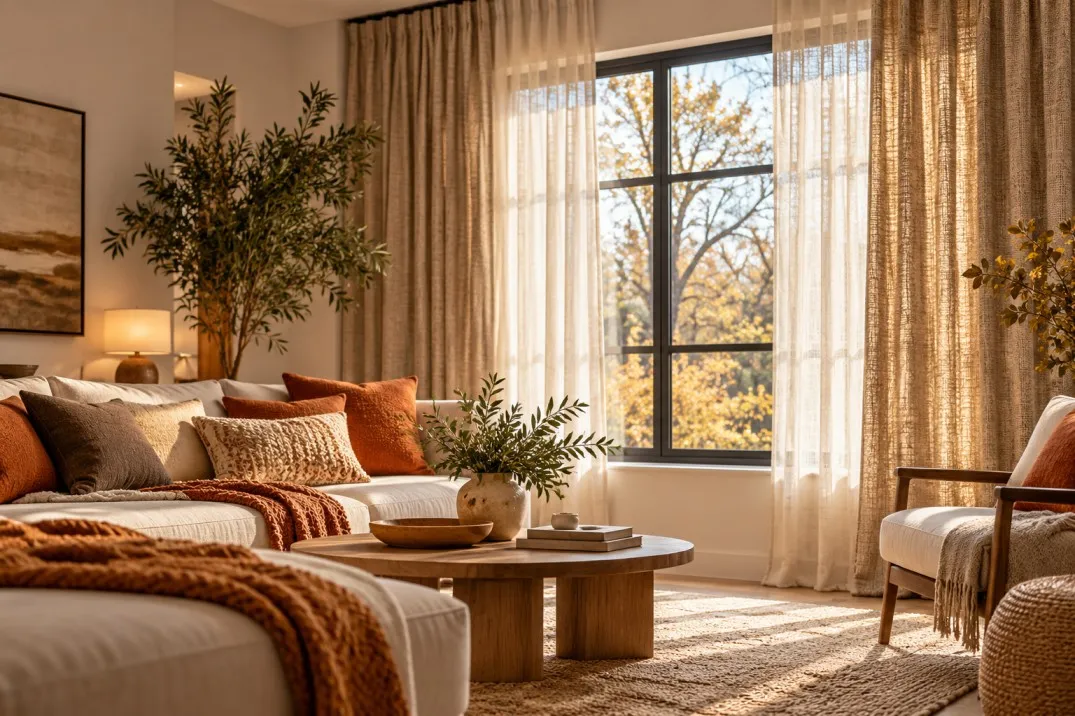
Modern interiors are often built around clarity: clean-lined furniture, smooth cabinetry, hard flooring, pale walls and a carefully edited palette. The result can feel calm and spacious, but it can also become visually cool if too many surfaces share the same smooth, hard character.
The window is one of the easiest places to introduce softness without disturbing that simplicity.
A fabric blind, subtle weave or gently textured finish can change the atmosphere of the room while preserving its contemporary feel. The aim is not to make a modern interior more decorative. It is to give the clean architecture enough softness that the space feels comfortable rather than stark.
Start by identifying where the room feels hardest
Before choosing fabric, look at the materials already present.
A modern living room may contain:
- timber or tiled flooring;
- painted plaster;
- glass;
- metal lighting;
- smooth cabinetry;
- leather upholstery;
- stone or composite surfaces;
- and relatively little visible fabric.
None of these materials is a problem individually. The issue is repetition.
If almost every large surface is hard, flat or reflective, the room may need texture more than it needs another colour.
The window is particularly useful because it can introduce a softer material over a relatively large area without adding another piece of furniture.
Think in terms of contrast rather than decoration
Texture works best when it provides a counterpoint to the rest of the room.
A smooth floor can benefit from a softly woven blind. Crisp cabinetry can sit comfortably beside a fabric with a visible but restrained texture. Minimal furniture can feel less severe when the window introduces a material that absorbs light rather than reflecting it sharply.
This does not require an obviously rustic fabric.
Modern interiors usually respond better to texture that is subtle enough to be noticed gradually.
For homeowners considering wardle blinds for a room dominated by clean lines and hard finishes, comparing plain and textured samples from across the room can help show how much visual softness the window really needs.
The right material often makes its presence felt without becoming a focal point.
Use texture before adding more colour
A room can feel cold even when the colour palette is already right.
That is where texture becomes especially valuable.
If the walls, flooring and furniture already work together, introducing a new accent colour may complicate the scheme unnecessarily. A blind in a familiar neutral with a more tactile surface can add depth without changing the palette.
For example, a warm off-white woven treatment can feel very different from a perfectly smooth white one even though the colours are close.
Likewise, a textured grey-brown can create more warmth than a flat grey of similar depth.
The effect comes from how the material responds to light, not simply from its colour.
Let the blind soften strong architectural lines
Modern windows often have clear geometric frames, especially where black, grey or slim-profile glazing is used.
Those frames can look elegant, but combining them with an equally hard-looking blind may make the opening feel overly graphic.
A softer fabric can create a useful contrast.
It allows the structure of the window to remain visible while reducing the impression that every element has been drawn with the same sharp line.
This is particularly effective on larger windows where the frame already provides enough architectural definition.
The blind does not need to repeat that strength.
Warmth does not have to mean beige
There is a tendency to associate warmer interiors with cream, tan and brown, but colour temperature is more flexible than that.
Muted green, dusty blue, soft clay, warm grey and subdued olive can all create a warmer atmosphere if their undertones relate to the rest of the room.
Even darker shades can feel inviting when combined with tactile materials.
The important distinction is between warm-looking and overly yellow or brown.
A modern room can remain restrained and contemporary while moving away from cool, flat neutrals.
Pair texture with natural materials already in the room
If the space already contains timber, wool, linen, leather or natural stone, use those materials as clues.
The blind does not need to imitate them.
Instead, choose something with a similar level of softness or visual irregularity.
A subtle woven finish may complement oak flooring. A slightly slubby texture may sit naturally with linen upholstery. A soft fabric can balance polished stone without trying to match it.
These relationships make the room feel coherent because the materials speak to one another rather than simply sharing a colour.
Look at the room in evening light
Texture becomes especially interesting after dark.
During the day, strong natural light may flatten certain fabrics. In the evening, lamps and lower-level lighting can reveal more depth across the surface.
This is why a blind sample that looks very plain in daylight may feel richer once the room is lit artificially.
Check how the fabric looks under the lamps you actually use.
A warm bulb may bring out beige or brown undertones. Cooler lighting can make some greys appear sharper. Deep texture may cast more visible shadow.
The evening version of the room is often where the benefits of fabric are most noticeable.
Use the window to balance minimalist furniture
Minimal furniture can look beautifully sculptural, but if every piece has a clean silhouette and little visible texture, the room may lack softness.
A fabric blind can provide that missing layer without forcing the furniture itself to change.
This works particularly well with:
- low-profile sofas;
- slim-legged tables;
- simple dining chairs;
- fitted cabinetry;
- and open shelving.
The blind becomes part of the background composition, giving the furniture something softer to sit against.
It is a quiet way to make the room feel less severe.
Avoid overloading the room with several textures at once
Once texture starts working, it is easy to keep adding more.
That can weaken the effect.
A strongly woven blind, heavy boucle sofa, thick rug, slubby curtains and several knitted accessories may make the room feel overly styled rather than naturally layered.
Choose a few surfaces to carry the tactile interest.
If the sofa is already highly textured, the blind can be quieter. If the furniture is very smooth, there is more room for the window treatment to contribute.
Texture needs hierarchy just as colour does.
Consider how the blind looks when fully closed
A fabric sample may appear subtle in the hand but stronger once it covers a large window.
The texture repeats across the entire surface, and that can make the treatment more prominent than expected.
This matters particularly where the blind sits behind a dining table, sofa or bed.
Stand back and imagine the whole opening closed.
Does the fabric provide enough softness, or does it become too visually busy?
Someone exploring blinds greetland for a modern room with expansive glazing should judge the material at the scale of the full window rather than relying only on a small sample.
Texture should enrich the room, not turn the window into a dominant feature.
Let the open position remain visually tidy
Modern interiors usually rely on a sense of order.
That means the blind needs to work when open as well as when closed.
If a large amount of fabric gathers visibly at the top of the window, the treatment may undermine the clean lines it was intended to soften.
Look at:
- the amount of visible material;
- the shape of the headrail;
- the relationship with the frame;
- and how much glass remains unobstructed.
The ideal balance is softness without visual bulk.
The room should still feel crisp, just less hard.
Layer fabric selectively
Curtains can add further softness, but they are not essential in every modern room.
Where blinds alone feel too spare, curtains can help frame the window and add vertical texture.
The two treatments should not both demand attention.
If the blind has visible texture, curtains may work best in a plainer fabric. If the curtains have strong weave or colour, the blind can be more restrained.
Layering is most successful when the materials have different roles.
One can provide privacy and light control while the other contributes softness.
Use rugs and upholstery to support the window
The blind should not be the only textured surface in the room.
A rug or upholstered piece can help create a wider material story.
The repetition can be subtle.
A woven blind does not require a woven sofa. A rug with a softer pile may be enough to create balance. Linen cushions can echo the relaxed character of the window without copying its material exactly.
The room feels warmer when softness appears in several places but remains controlled.
Keep metallic details from making the scheme too cool
Chrome, brushed steel, black metal and polished finishes can make modern interiors feel sharp.
They often work beautifully, but if combined with pale walls, glass and hard floors, the effect can become slightly cold.
Fabric at the window provides a useful counterweight.
The contrast between metal and textile is particularly effective because the materials are so different.
There is no need to hide the metal details.
A softer background simply gives them more context.
Consider the scale of the weave
Texture has scale just as pattern does.
A fine weave may appear almost plain from across the room. A coarser material can become much more visible and informal.
The right choice depends on the architecture and furniture.
A highly refined modern kitchen may suit a finer texture. A relaxed contemporary living room with timber and upholstered furniture can often support something more visible.
Always view the sample from the normal seating distance.
Close-up detail is less important than how the material reads across the room.
Use warmer whites carefully
White blinds can still make a room feel warm if the shade is right.
Brilliant white can appear crisp beside warm timber or cream walls, while a softer off-white may create a gentler transition.
The surrounding paint matters enormously.
A blind that appears neutral on its own may suddenly look yellow, blue or grey once placed against the wall.
Compare samples directly with the actual finishes rather than choosing from memory.
Small undertone differences become more obvious across a full window.
Let natural light reveal the material
One of the advantages of textured fabric is that daylight changes it throughout the day.
Side light can make the weave more visible. Softer overcast conditions may flatten it. Strong sunlight can bring out warm undertones.
This changing appearance can make a modern room feel less static.
The effect is subtle, but it introduces a sense of depth that smooth finishes often lack.
Rather than seeing this variation as a problem, consider it part of the material’s character.
The room can look slightly different from morning to evening while remaining coherent.
Keep patterns restrained where texture is already doing the work
Pattern and texture can coexist, but they do not both need to be strong.
A fabric with a pronounced weave may already create enough visual interest.
Adding a strong printed motif on top can make the treatment feel much more decorative.
In minimalist or contemporary interiors, a restrained approach is often more convincing.
Small tonal pattern or slight material variation can add depth without interrupting the clean design language.
The blind should feel sophisticated rather than busy.
Use the window to soften open-plan spaces
Open-plan rooms often combine several hard-working zones: kitchen, dining and living.
The kitchen may contain especially hard finishes, while the seating area introduces more fabric.
A textured blind across shared glazing can help bridge those environments.
It provides a softer material that relates naturally to the living area while remaining restrained enough to sit beside cabinetry and worktops.
This is particularly useful where the same windows are visible from several parts of the room.
The treatment becomes a unifying element.
Do not mistake minimalism for the absence of comfort
A modern interior does not have to be sparse to feel contemporary.
Softness does not undermine clean design.
In fact, a room with disciplined lines often benefits most from a few carefully chosen tactile surfaces because they stop the scheme feeling overly controlled.
The key is editing.
One well-chosen textured blind, a generous rug and a small amount of soft upholstery may be enough.
Comfort comes from balance, not quantity.
A practical styling checklist for adding warmth
Before choosing the final window treatment, consider:
- Which surfaces already feel hard or reflective?
- Does the room need more texture or genuinely more colour?
- Could a warmer neutral improve the palette?
- Does the blind relate to timber, upholstery or flooring?
- How visible is the texture from across the room?
- Does the fabric become too dominant when fully closed?
- Is the open position still clean and ordered?
- How does the material look under evening lighting?
- Are curtains necessary, or would they add too much?
- Is there enough softness elsewhere in the room?
- Are metallic and glass elements making the scheme feel cold?
- Does the weave suit the scale and style of the furniture?
- Do the undertones work with the actual wall colour?
The strongest choice usually introduces enough tactile interest to change the atmosphere without making the window the main event.
Warmth can come from material, not clutter
A modern interior does not need more objects to feel more comfortable.
Often, it simply needs a better balance between hard and soft surfaces.
Fabric at the window can provide that shift with very little visual disruption. A considered weave, warmer undertone or subtle texture can soften sharp frames, hard flooring and minimalist furniture while preserving the clean character of the room.
The result is still modern, but it feels easier to live in.
Frequently Asked Questions
Can textured blinds work in a very minimalist room?
Yes. Texture can be particularly effective in minimalist interiors because it adds depth without requiring additional pattern, accessories or strong colour. A restrained material can keep the room clean while making it feel softer.
What colours make a modern room feel warmer?
Warm neutrals, muted greens, clay tones, soft taupes and warmer greys can all help, but undertone matters more than the colour name. The shade should be tested against the flooring, walls and furniture already in the room.
Is fabric better than a smooth finish for adding warmth?
Not always, but fabric and visible texture can provide a softer visual contrast to hard surfaces such as glass, stone, tile and metal. The best choice depends on how much texture the room already contains.
Can I combine textured blinds with curtains?
Yes. The combination works best when the two treatments have different levels of visual emphasis. If the blind is strongly textured, simpler curtains may provide better balance, and vice versa.
How do I know whether a fabric texture is too strong?
View the sample from the normal seating distance and imagine it across the whole window. If the texture begins to dominate the wall rather than simply soften it, a finer weave or quieter finish may be more suitable.